THE PROJECT
A distinctive mark.
A confident presence.
A future-forward tech identity, expressed through a distinctive monogram and a clear visual language.
- CLIENT
- Optazone
- DISCIPLINE
- BRAND IDENTITY
- STUDIO
- XAI Studios
01 / The brief
Give a technology business a distinct voice.
Optazone presented itself as a provider of software solutions and hosting services. Its identity needed to introduce the business clearly, then give its audience a recognisable visual language to learn over time. The project discussions named three desired attributes: futuristic, dynamic and authoritative. Those words guided the visual exploration; they are creative criteria, not claims about technical performance.
02 / The identity
A continuous mark with room to adapt.
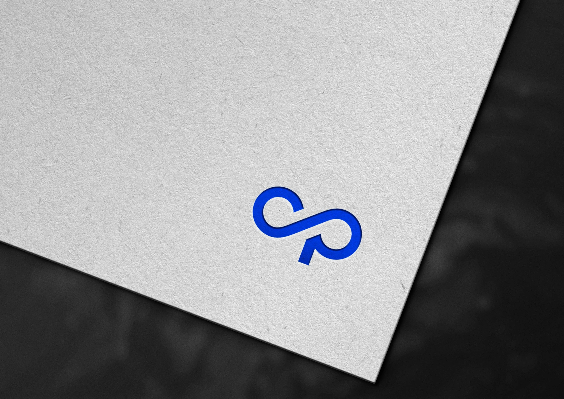
The blue monogram gives Optazone an immediate signature. Its continuous form can be read at a small scale, while the larger wordmark carries the name in full. The identity was explored as a system, not just a standalone icon: typography, colour and applications were considered as separate stories for the brand to share with its audience. The work shown here documents the design direction, not the manufacture of signage or business cards.

03 / Applications
From signature to setting.
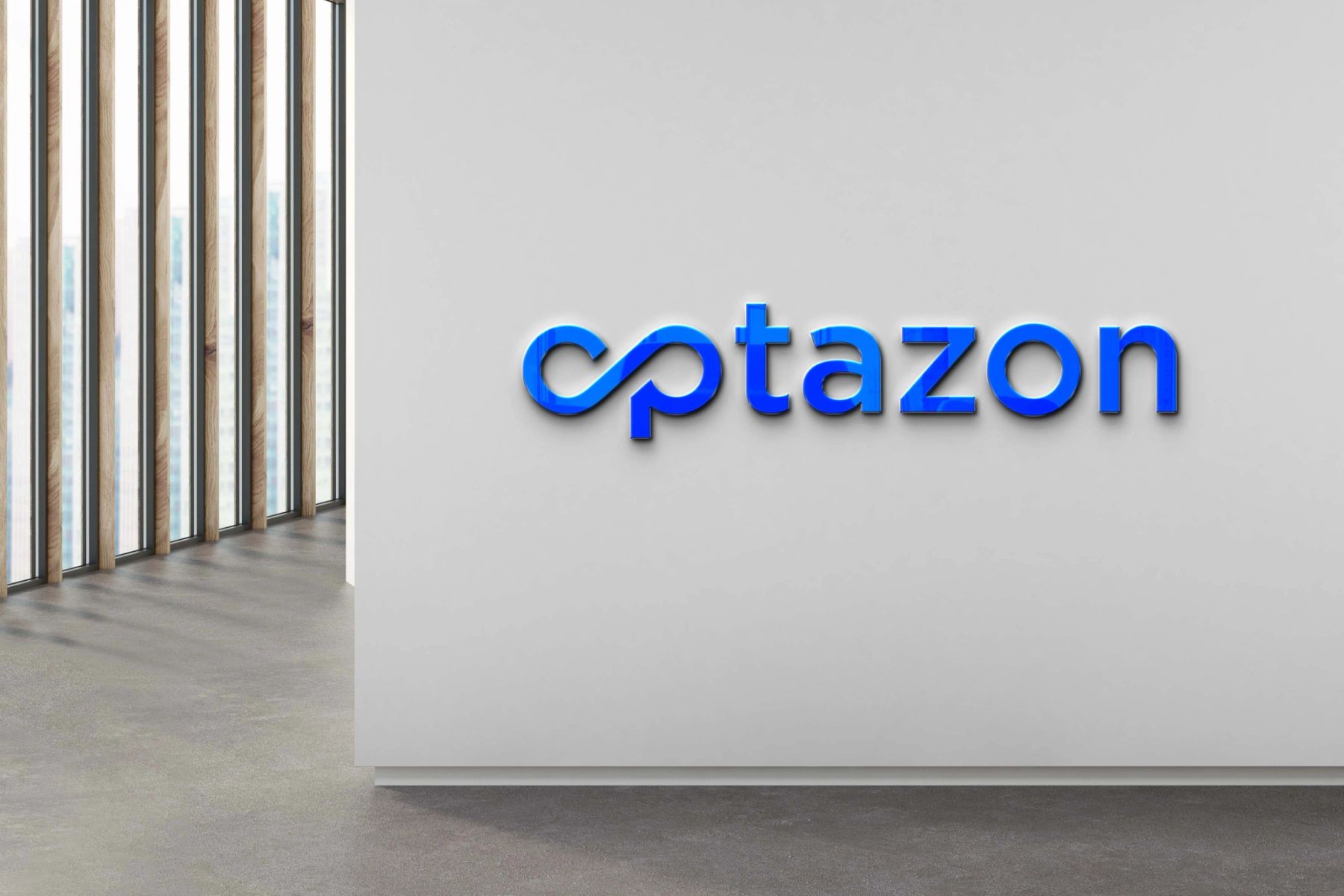
The continuous blue mark extends beyond the textured stationery into blue-and-white business cards and a spatial-signage presentation. The mockups test how the identity reads at different scales and against different materials; they are visual proposals, not claims of manufactured installations.

A CLOSER LOOK
Identity, made tangible.
The selected artwork brings the Optazone mark into a tactile setting. Blue lettering and a restrained composition keep the identity at the centre of the experience.
A closer look at the monogram and texture. Gallery details are crops of the selected archive artwork.
Ozithy Nylon Depot