THE PROJECT
Geometric character.
Everyday presence.
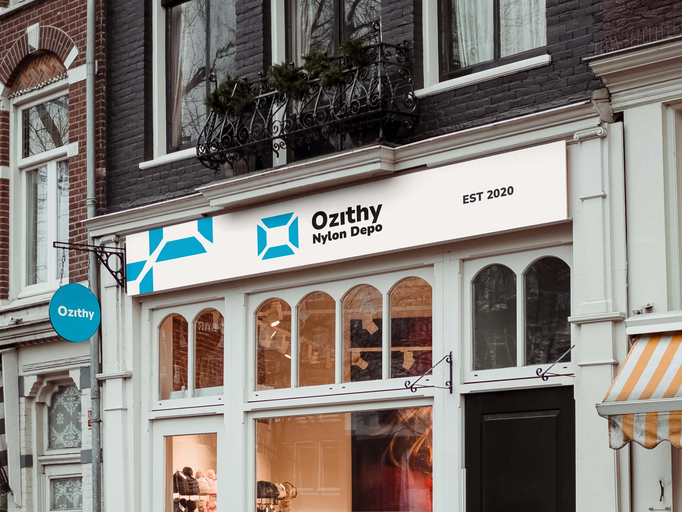
A geometric visual identity for Ozithy Nylon Depot, seen through its mark and storefront application.
- CLIENT
- Ozithy Nylon Depot
- DISCIPLINE
- BRAND IDENTITY
- STUDIO
- XAI Studios
01 / The starting point
Reintroducing an existing packaging business.
Ozithy was already selling packaging materials, including nylon bags, to individuals and other brands. Customisable packaging was part of its offer. The ambition was to become a more recognisable destination for packaging in Nigeria and beyond. This was a rebrand of an existing business, not the launch of a new one; the work had to make its offer clearer while giving the brand a more distinctive presence.
02 / The brief
A clearer identity for a retail experience.
Ozithy Nylon Depot needed a visual language that could feel distinct across its retail communications and digital storefront. The direction connects a recognisable mark, a consistent colour system and practical layouts for products and promotions. This case study presents the identity and website design, not a measured sales outcome.
03 / Identity
Build recognition from a simple idea.
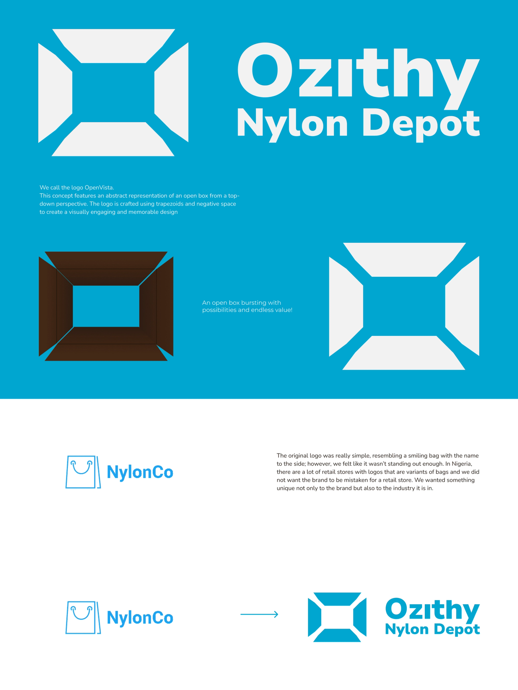
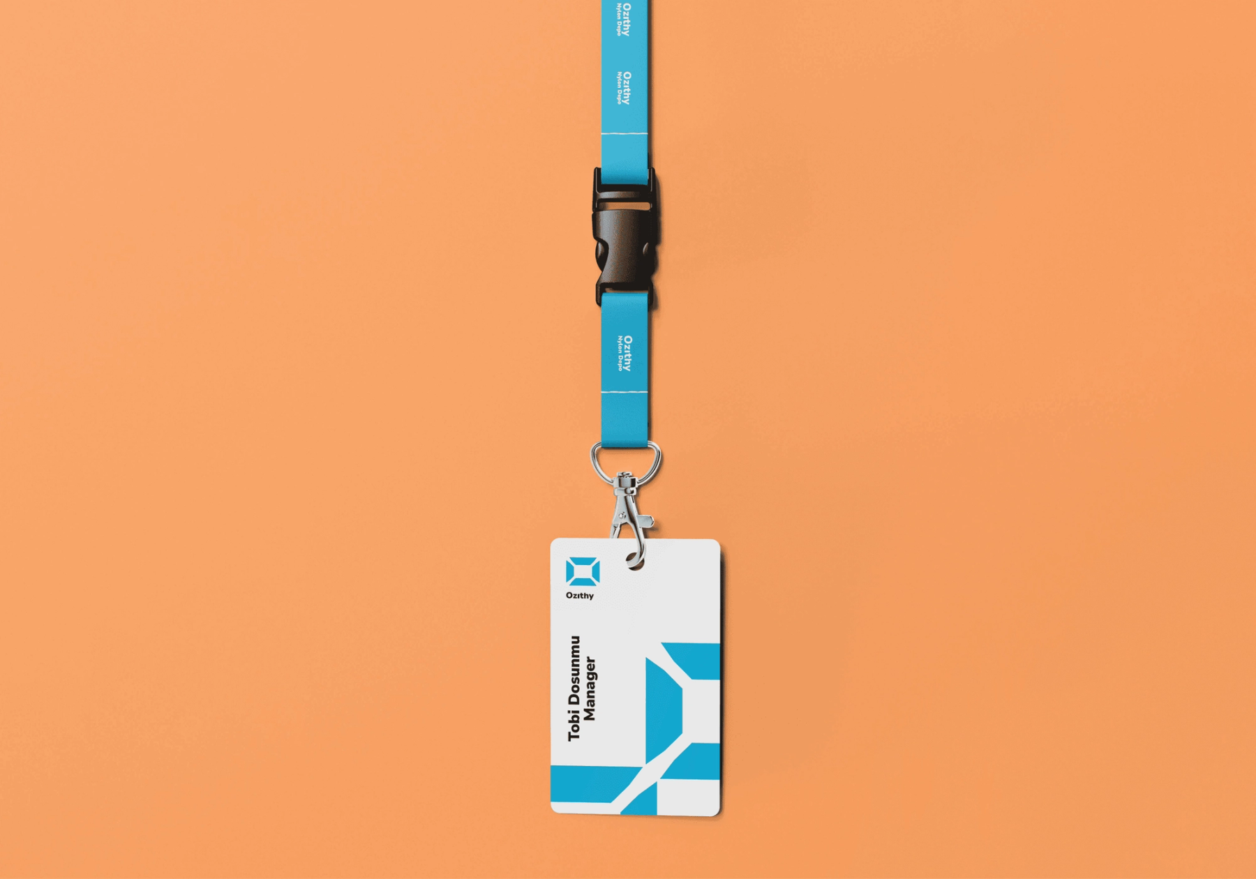
The identity development explores an open-box form: a straightforward symbol suited to a business built around everyday goods. The mark is supported by a blue-led palette and a visual system that can move between compact signatures and larger branded surfaces. The process presentation shows how the direction was refined; the application mockup shows how it can live beyond a flat logo file.
04 / Digital experience
Make the product the focus.
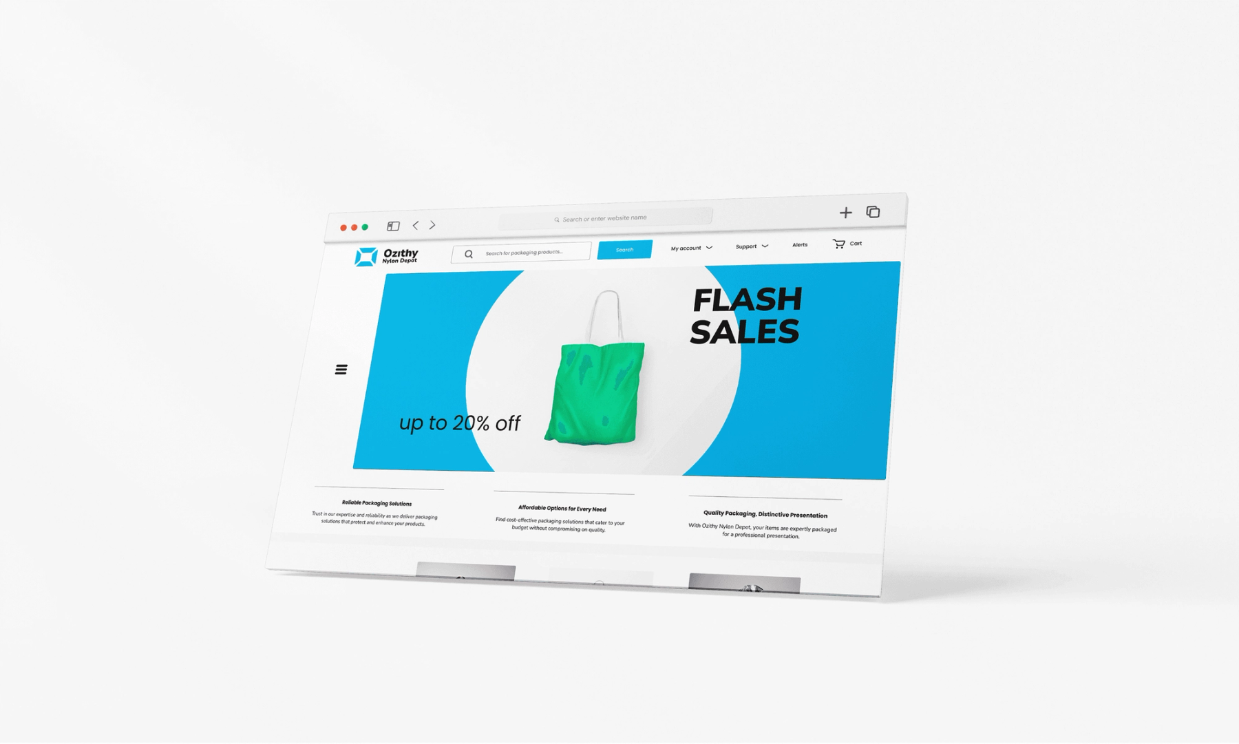
The website direction brings the identity into a shopping environment. Clear product hierarchy, room for imagery and recognisable promotional moments make the brand useful as well as expressive. The screen shown here is a design presentation mockup of that direction, not evidence of a live store or commercial result.
05 / Digital experience
The identity carries into the shop.
The website design applies the brand system to product browsing, shopping-bag imagery and e-commerce hierarchy. This in-context film shows the designed interface on a laptop; it is a presentation of the digital work, not a claim of live sales performance.



A CLOSER LOOK
From mark to place.
The storefront artwork shows the identity in a physical setting. The geometric symbol and name work together to establish a recognisable presence.
A detail from the storefront application. Gallery details are crops of the selected archive artwork.
Baron Architecture