THE PROJECT
23rd Thrift Ville
A playful, typography-led identity for a Lagos thrift and consignment store, making affordable fashion feel confident and distinctive.
- CLIENT
- 23rd Thrift Ville
- DISCIPLINE
- Brand identity
- STUDIO
- XAI Studios
01 / The brief
Where frugality meets fashion.
23rd Thrift Ville is a Lagos thrift and consignment store built around quality, affordable fashion. Its promise—“frugality at its finest”—asked for an identity that would feel inviting and stylish without losing the value-minded spirit of the business.
The visual direction pairs pink and white for a fresh, feminine presence. Rather than make affordability look austere, the system gives smart shopping its own confident personality.
02 / The process
From research to a distinctive mark.
The identity process began with research into Nigeria’s thrift and consignment market, followed by brainstorming, sketches and iterations. The question was how to signal quality and style while keeping the brand’s accessible, deal-finding character in view.
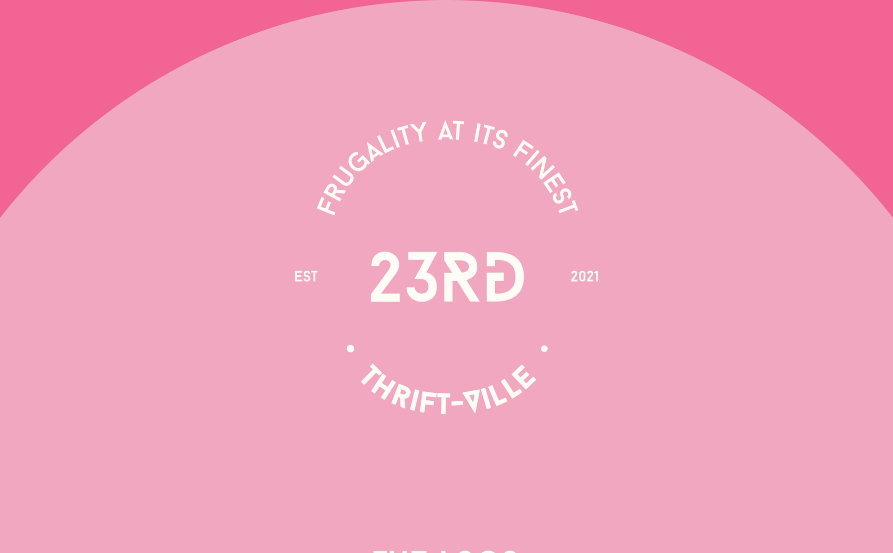
The chosen direction is a stamp-like, typography-led logo. The selected typeface gives it a clean structure with a playful edge. The mark was selected to communicate affordability, quality and style clearly across different sizes and uses.
03 / The identity
Designed to travel beyond the logo.
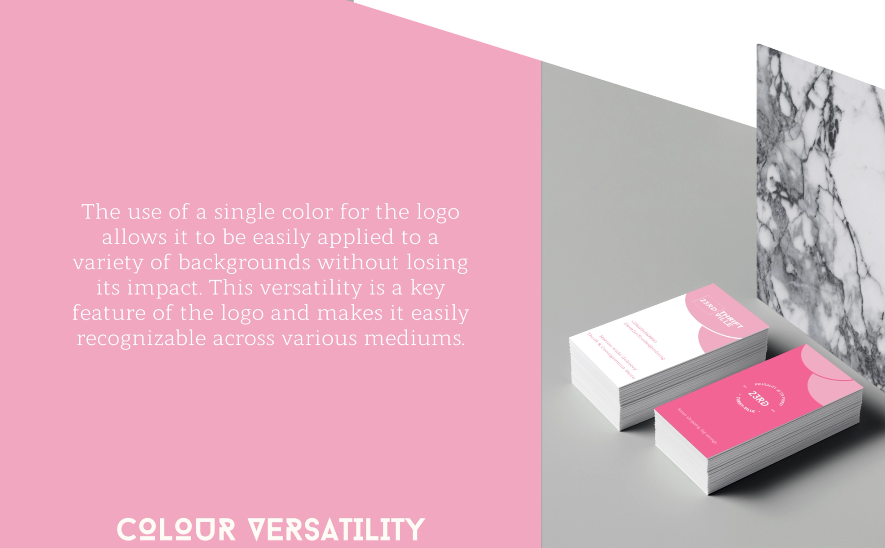
The one-colour, typography-led mark is meant to remain recognisable against different backgrounds. Its simple structure makes it suitable for small print pieces as well as larger fashion-led imagery.
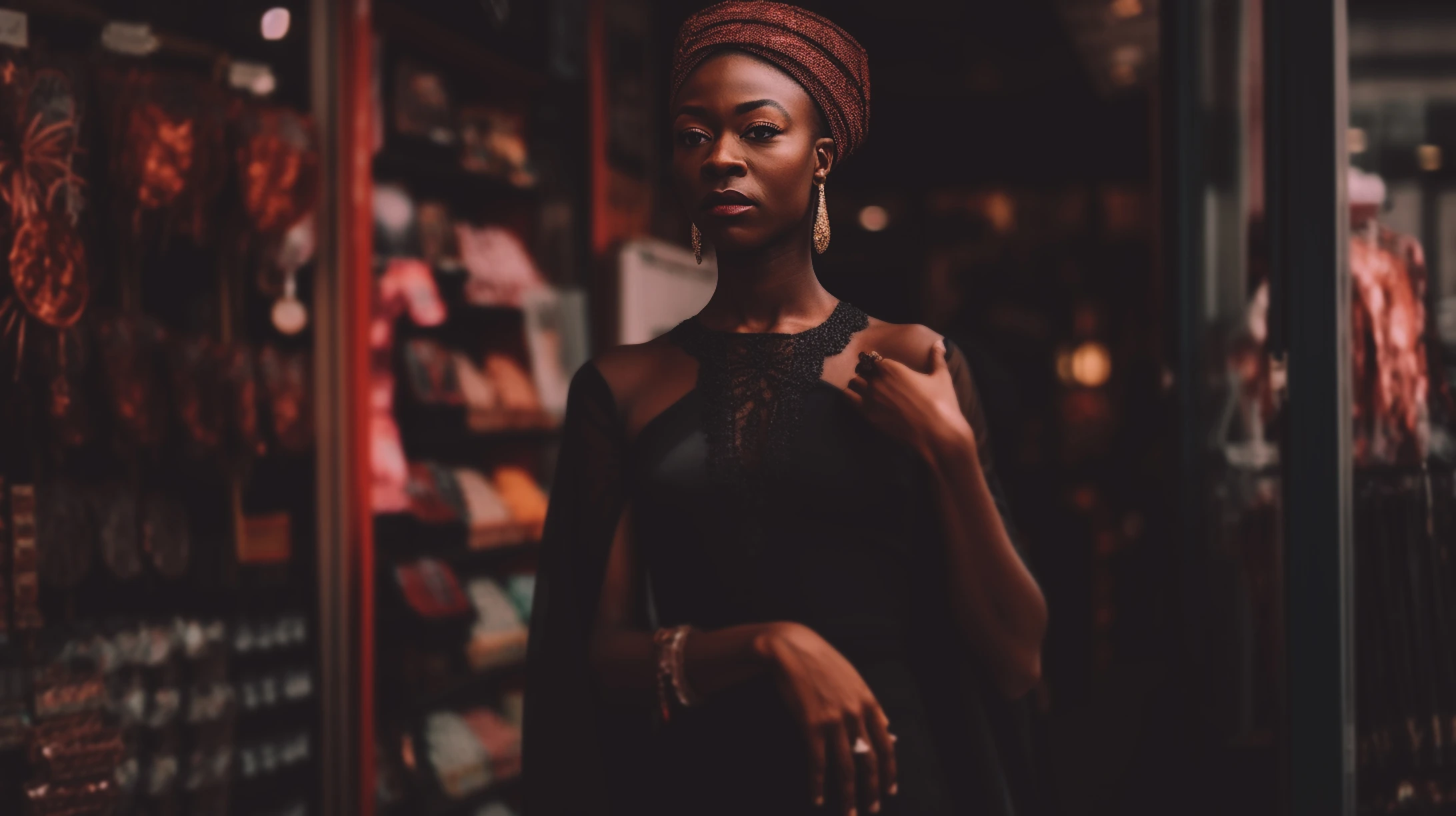
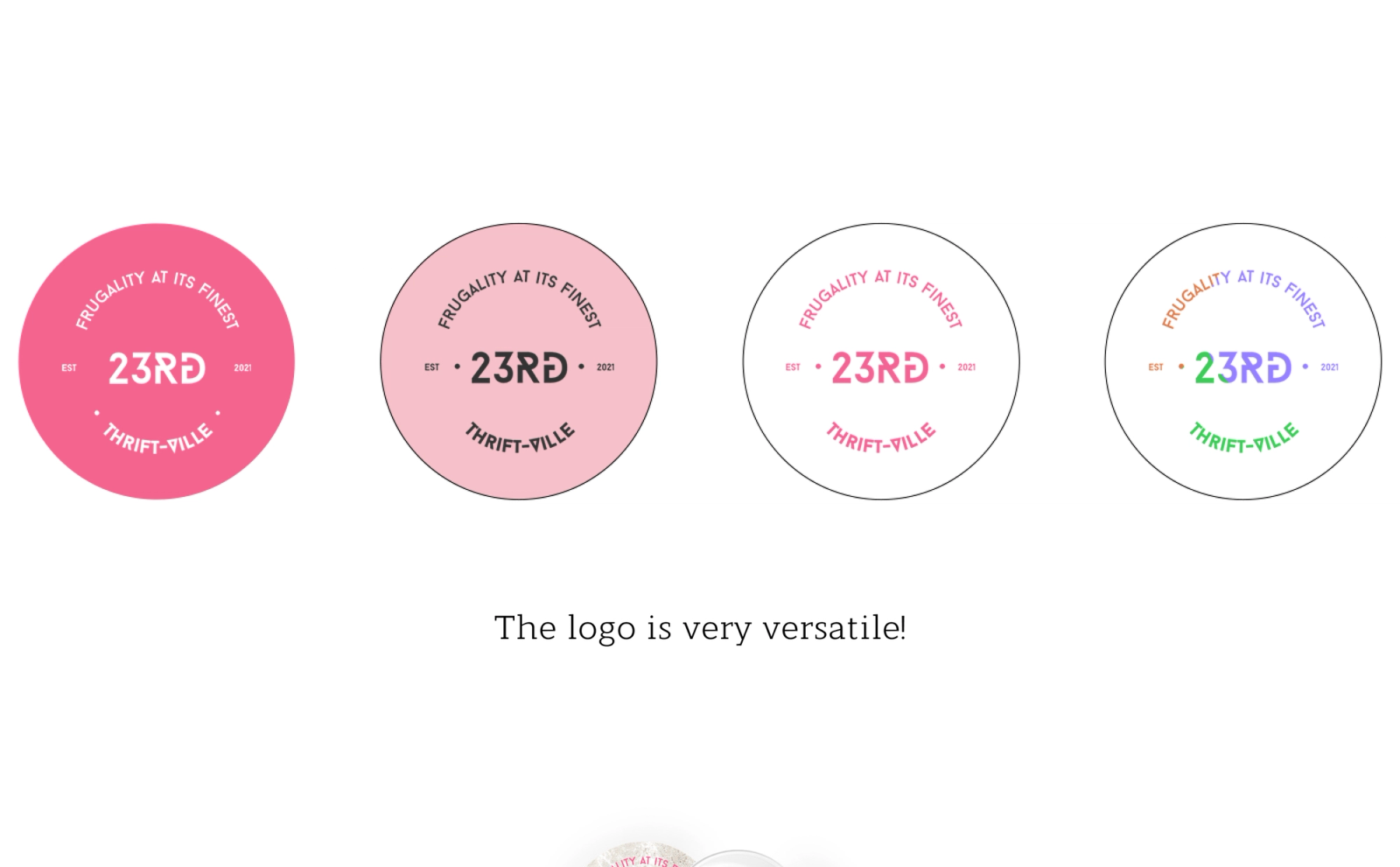
The Figma presentation tests that flexibility through a portrait composition, colour variations, a paper badge and business-card mockups. These are visual applications of the proposed identity—not evidence of printed production or measured commercial results.
04 / Applications
The identity in everyday use.
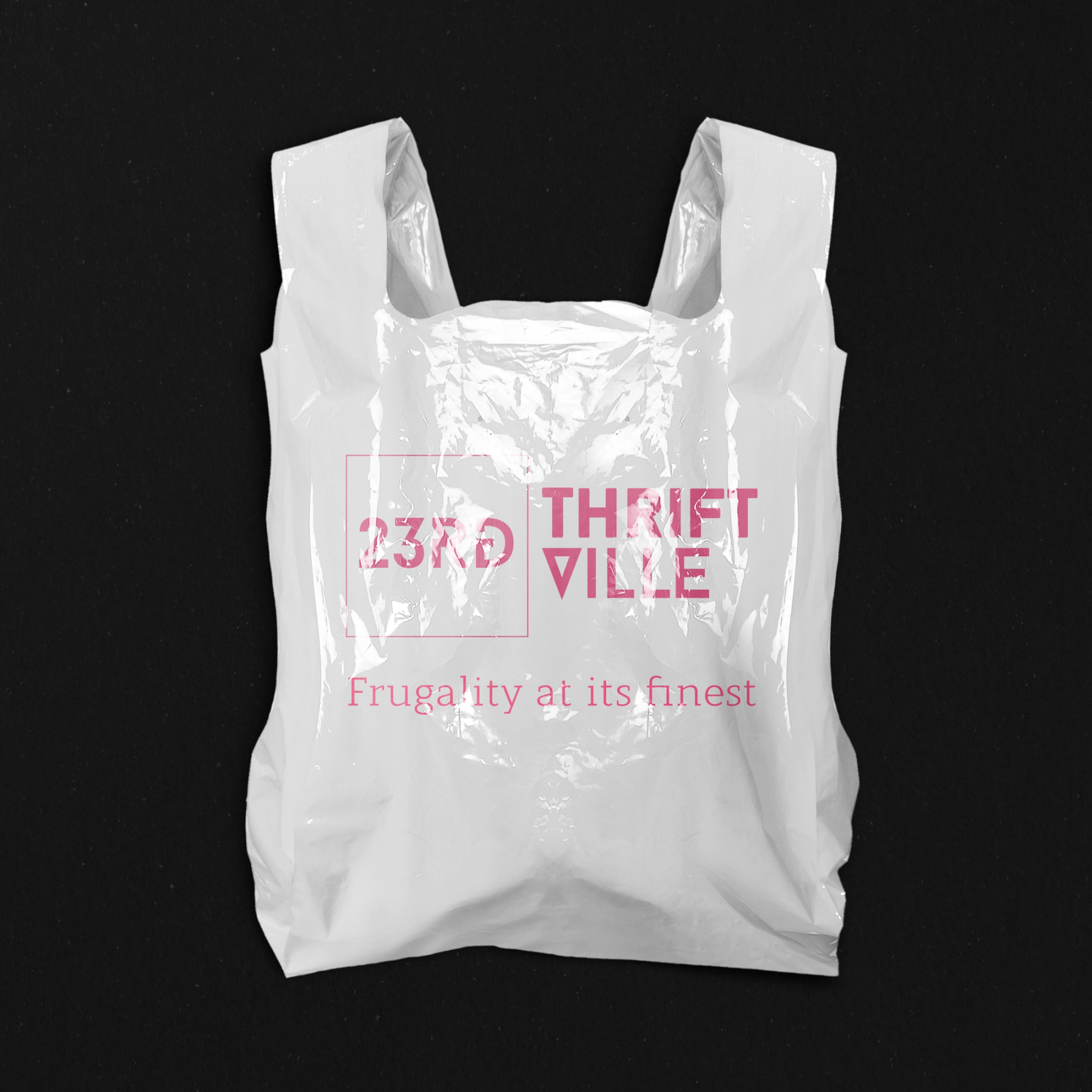
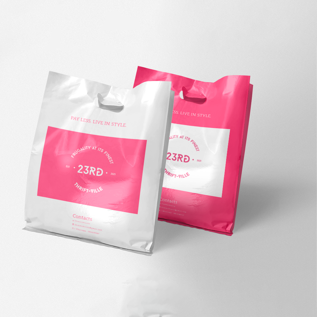
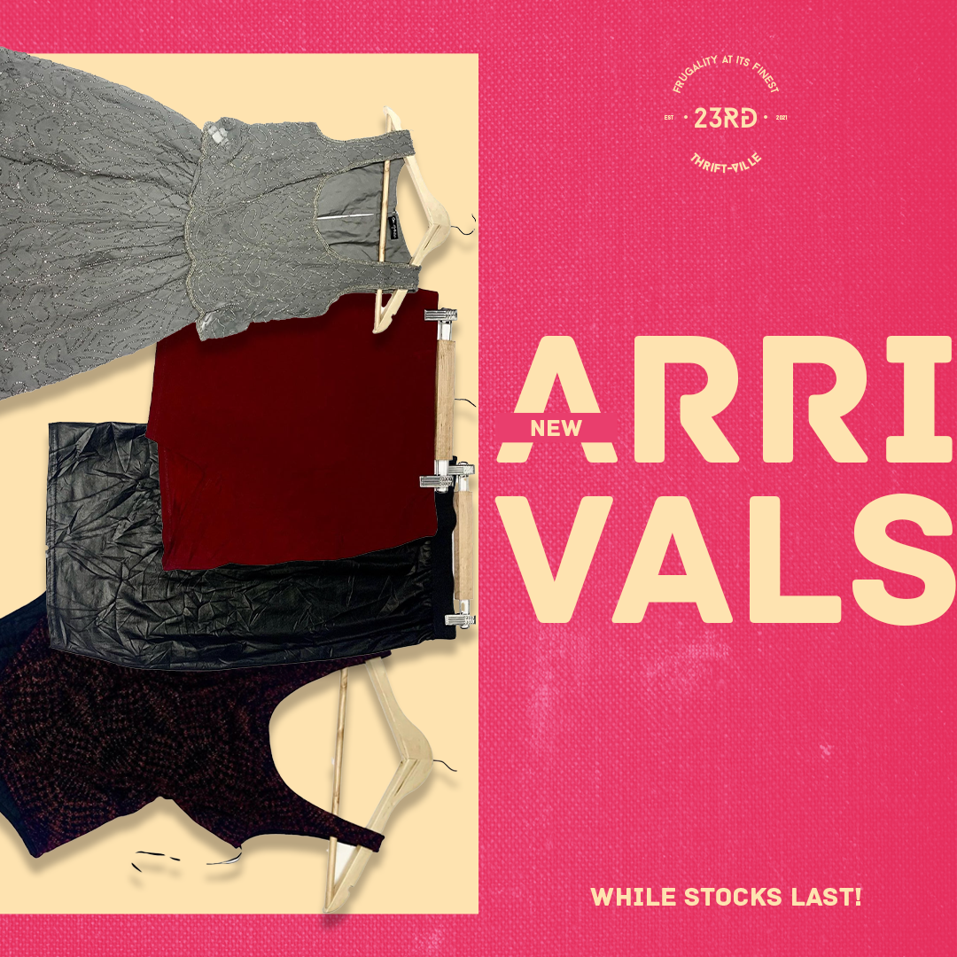
The mark was carried through packaging and social artwork. Pink and white keep the system recognisable while allowing the work to shift between a simple bag, a shopping-bag pair and a fashion-led new-arrivals graphic. These are design applications and mockups, not claims of manufactured production.
05 / Motion
A signature with movement.
The circular wordmark also has a finished animated version. The film adds timing and sound to the identity while preserving the same pink typographic character.
Closer Than We Know